
Choosing the cover colours was something I spent time over more than I should have white just didn’t seem to work I couldn’t see it working but black matches the images but is it the same shade of black as the images dose that matter is do the images have just one shade of black. I also tried gray as a neutral in-between but that didn’t work at all. Sally mans book has a black cover but the images inside are on white paper I think that works. It would have to be a black matt colour as a gloss just gets very fingerprintey .
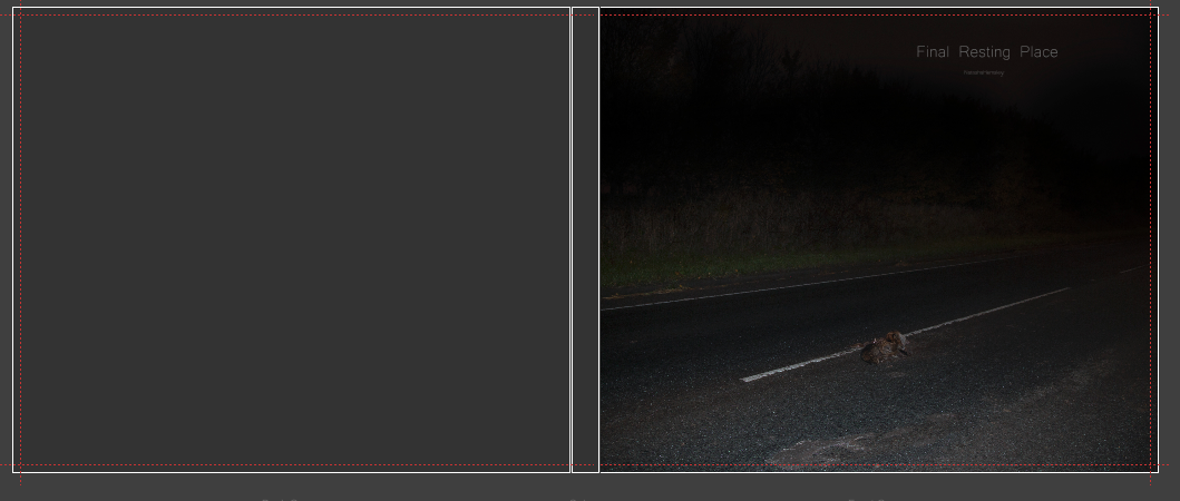
The font is something I have also been thinking about I didn’t want it to be to edgy it needed to be smooth and easy to read when small also the colour of the font was something to think about white was to bright so I opted for a grey I am not 100% happy with the grey but other colours seem silly like brown and red I wanted the hole book to be very simple. And as fine art as I could make it. What would be an idea is to find books with black cover and see what colours they have used and what worked for them.
The font is something I have also been thinking about I didn’t want it to be to edgy it needed to be smooth and easy to read when small also the colour of the font was something to think about white was to bright so I opted for a grey I am not 100% happy with the grey but other colours seem silly like brown and red I wanted the hole book to be very simple. And as fine art as I could make it. What would be an idea is to find books with black cover and see what colours they have used and what worked for them.

|
|


| 
|
 RSS Feed
