• Home
  • Projects
    • Cessation
    • Final Resting place
    • Drowning: my dreams in Scanograms
  • Contact
  • About

poems 

3/31/2014

 
so I have been writing poems each time we go out and find something  it documents my feelings when i see the animal the state its in ect


text is very important to me and I need to figure out what I am trying to say with the photos.
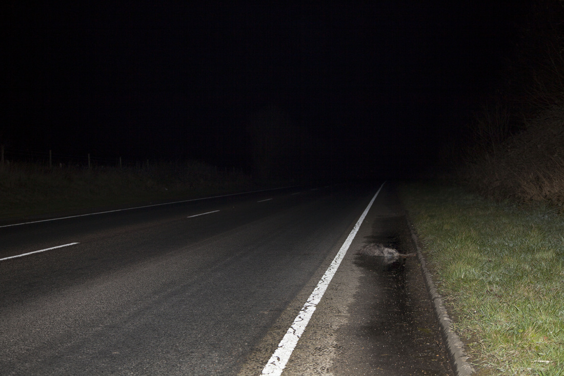
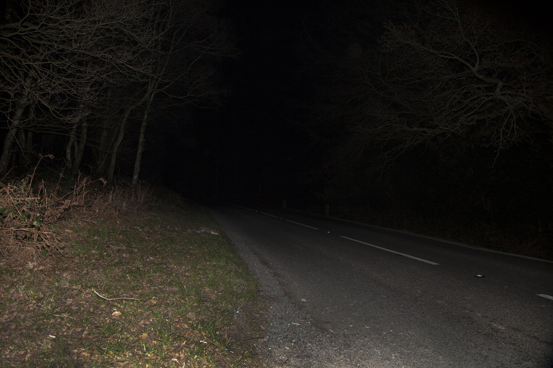
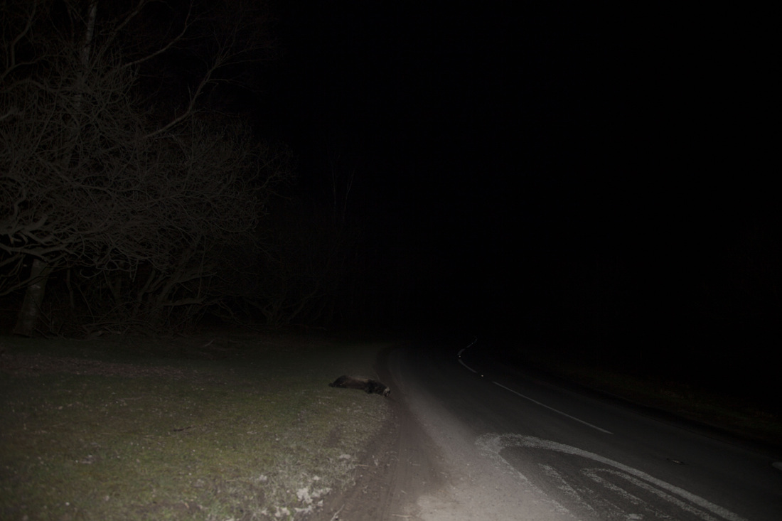
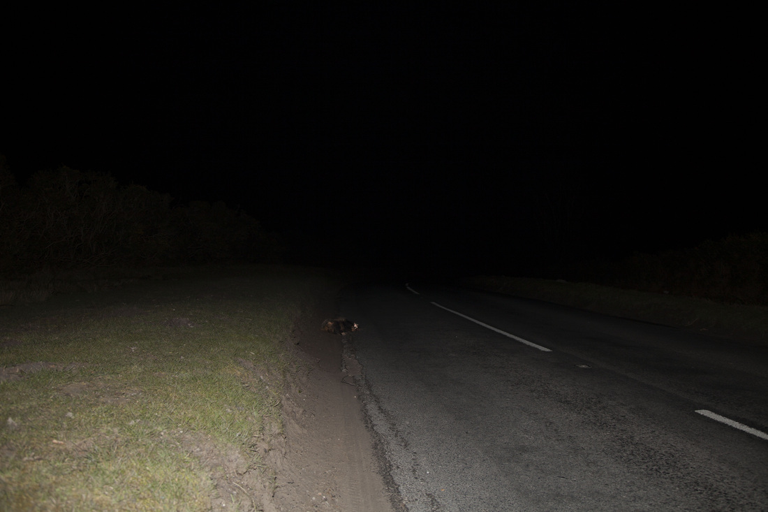
I have taken them all in the same way with a flash  at night
the photos become dark the further back you look if that makes sense i wanted it to be like fading to blackness like the body shutting down. the flash is all about being quick I'm hoping the death was instant and having tryed out a long exposure it created a different meaning.  the flash just gave it a white light something you asoseate with dying seeing a white flash of light.


so the images are about the impact the car had on the animal i didn't want it to be close but you can see from the images the outline of what's left of the animal
i think that's all you need I have looked twords crime scene photographers because they have to document what's in front of them as is. and that's persisly what i wanted to do show the animal in its last resting place as clearly as I could.

I'm not sure how to go about adding in the poems its all about how I felt when I saw the animal do I want people to have that knolage is it too personal are the poems good enough dose it change the meaning. 

my other option is to have the date time location and condition of the animal when found although theses are just cold facts not very interesting 


thinking about it poems could work its about the impacts cars have on animals the death adding a small poem to each image adds another layer of meaning almost giving the animal death an emotion i want people to see the animals death as a bad thing so many animals die on the roads each year adding emotion through words could make the images seem moor human like or is it giving people an emotion to work with when they are viewing the image.


paper colour

3/30/2014

 
paper size and colour is relay important  I would like to have a small  book sort of 8X10 in size most of the photo books are a4 or slightly larger  the images will be a bit smaller because the ratio  of the  of the images they don't don't fit fully. i did want a border round the images and i like the size of the images the way they are. for a book having the images smaller makes it interesting more personal you have to look for the animal. it will be the same in a galiry evanthough nthe images will be printed bigger people probaly wont get up close to the image so will have so serch for the animal thats what i want tpeople to look and find rather than it be in there face.  as regards to colour i think that whiye works the best its just very clean, simple its not off putting the black just blends in to the images to much and the conitations with black are very much about death and i don't want the book to be all dark the images have enough of that.  I wanted to try out the square paper becuase of How To Touch What by Lawrence Weiner, Eve Sonneman. all the images are on square paper but there images are in twos and the text is on the images so the problem of captions is not there where as with my book captions on squared paper dosen't work also i don't think there is any significance of squared paper. 

claire strand

3/23/2014


Harry Callahan: Color

3/18/2014

 
harry Callahan was a very influential photographer of the post war era his book layout for new colour is something  I relay like its very simple  and easy to read the captions some of the nooks I have looked at have had extremely  small text its something I find hard to look at. The size of the book is well proportions with the images its a good book size 14.5" x 14.5". there is enough room for text and image to be on the same page with out looking overcrowded the white border is almost like a frame that is  something I would like to have in my book   with regards to hard cover or soft over I think his book works better as a hard cover but I think  that mine would work better as a soft cover because its only going to be a small book and the idea of it being flexible like Clive lanens book makes sence.


Stephen  shore 

3/17/2014

 
Stephen shore book uncoman places  is something i love looking over its very simplely dose with to images to a page and text under the bottom left had side of each image the ise of the book is not to big not to small it works very well with te negative size. the images are not full bleed on the page but have awight border this is somthing i realy like with in the book something i think i might replicate. i supose the book has to be hard back.
the book has been published and republished so many times  i don't thini it has gone out of print since the relese of the complete works Published June 7th 2004 . that in ints self means the style of the book as well as the images is working.


Published by Aperture in 1982 and long unavailable, Stephen Shore's legendary Uncommon Places has influenced a generation of photographers. Among the first artists to take color beyond advertising and fashion photography, Shore's large-format color work on the American vernacular landscape stands at the root of what has become a vital photographic tradition. Uncommon Places: The Complete Works presents a definitive collection of the original series, much of it never before published or exhibited. Like Robert Frank and Walker Evans before him, Shore discovered a hitherto unarticulated version of America via highway and camera. Approaching his subjects with cool objectivity, Shore's images retain precise internal systems of gestures in composition and light through which the objects before his lens assume both an archetypal aura and an ambiguously personal importance. In contrast to Shore's signature landscapes with which 'Uncommon Places' is often associated, this expanded survey reveals equally remarkable collections of interiors and portraits. As a new generation of artists expands on the projects of the New Topographic and New Color photographers of the seventies-Thomas Struth (whose first book was titled Unconscious Places), Andreas Gursky, and Catherine Opie among them-Uncommon Places: The Complete Works provides a timely opportunity to reexamine the diverse implications of Shore's project and offers a fundamental primer for the last thirty years of large-format color photography.


April 09th, 2014

3/6/2014

 
Picture
This was the last image I took in Thanet this was one of three badgers In a row. The mangled state of the corpse was evidence of its time spent at the roadside. The decomposing stages had already started. The smell was not very nice I tried not to keep Bex next to the badger for to long when focusing.  Again the roadside was very buzzy so we di have to keep moving.  At this point we did stop for a little while as I had managed to walk in to a signpost on the long walk to the badger and was forming a large lump and an unwanted headache.  I keep going back to the fox with the curve in the road although there is no curve in the road I tried to creating a slight angle to the image in the hope it will make it more visually interesting.  At this point you cannot see anything on the other side of the road it dose add this ominous blackness. I like the way it feels like it is creeping in further to the image like the darkness is going to take over the badgers being. The exposure was F4 and with a shutter of 1/160 this brings as much light in to the image as possible while freezing the flash.    The focusing was difficult with this image because of the constant moving.

badger no.3 ashdown

3/1/2014

 
so this is the 3rd badger i have found yesterday i cane bleve they are all with in the same area. this one is hard to see again its on the verge how did a car get to it.  we do think they have been moved of the road so cars don't run over them any more. but are still left out i wonder if it was because they couldn't figer out how to despiosde of it or was is a reminder to the traffic that animals can be on the road.


i love the trees with in this image looming over the badgers body again I did try to take the image at slight angle to have that line drawing eyes on to the badger.
Picture

badger 3

3/1/2014

 
now I know this badger has been moved its back is very broken so it must have been hit there but its head is facing the road I am guessing someone moved it out of the road.  this is just another one of the images I'm not sure about focus wise i relay though it was in focus when i was shooting I checked 4 times on the small screen this was the best in focus one out of the 25 i took the curve in the road was something that didn't come out as much with in the image as i had hoped. i do like the fact there is a speed sign next to the badger it is another reminder of the car presents.
Picture

badger 1 ashdown

3/1/2014

 
this was the first of 3 badgers I had found yesterday this one was very fresh I looked like it had just been hit.

The landscape around the badger was quite barren we where on top of the forest so there where no trees only small amounts of gorse and heather. i did try to angle the image but the road is a very bussy one and i had to stand on the verge i think the image is in focus its something i have been having consent trouble with but in this image i can clearly see that it is an animal so i am not to worried I just need to get images at this point i just have ten images that are usable but one is a little out of focus i wish i could take more but it has been hard finding the animals to photography I suppose thats not a bad thing.
Picture

    Natasha hemsley

    major practical projects

    Archives

    April 2014
    March 2014
    February 2014
    January 2014
    December 2013
    November 2013
    October 2013

    Categories

    All
    Artist Reserch
    Book Reserch
    Ideas Comments
    Poems/book Text
    Presentation
    Project Images
    Reserch Road Kill
    Statment Evaluation

    RSS Feed

Powered by Create your own unique website with customizable templates.