
Evaluation
Over all I am happy with the results of a years work it had been very time consuming going out 2 3 times a week looking for road kill.
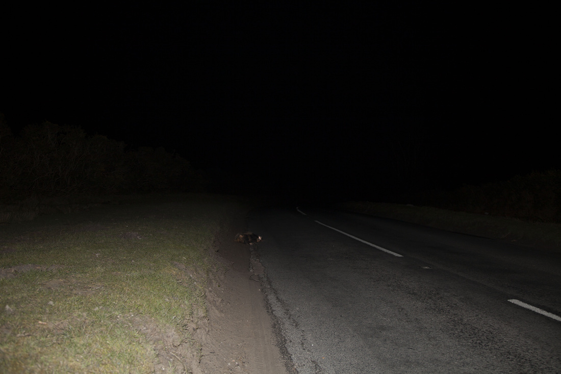
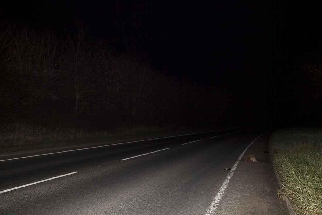
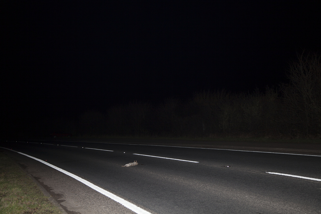
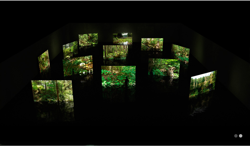
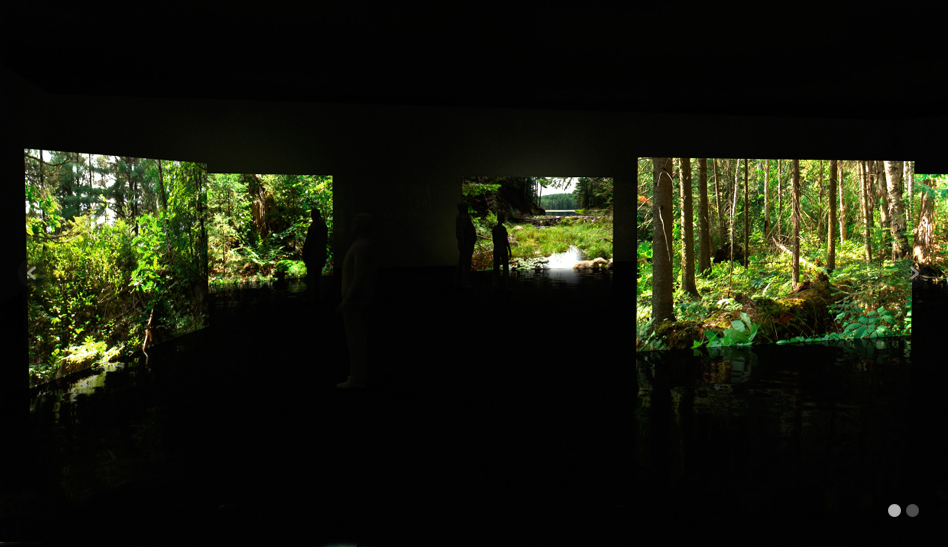
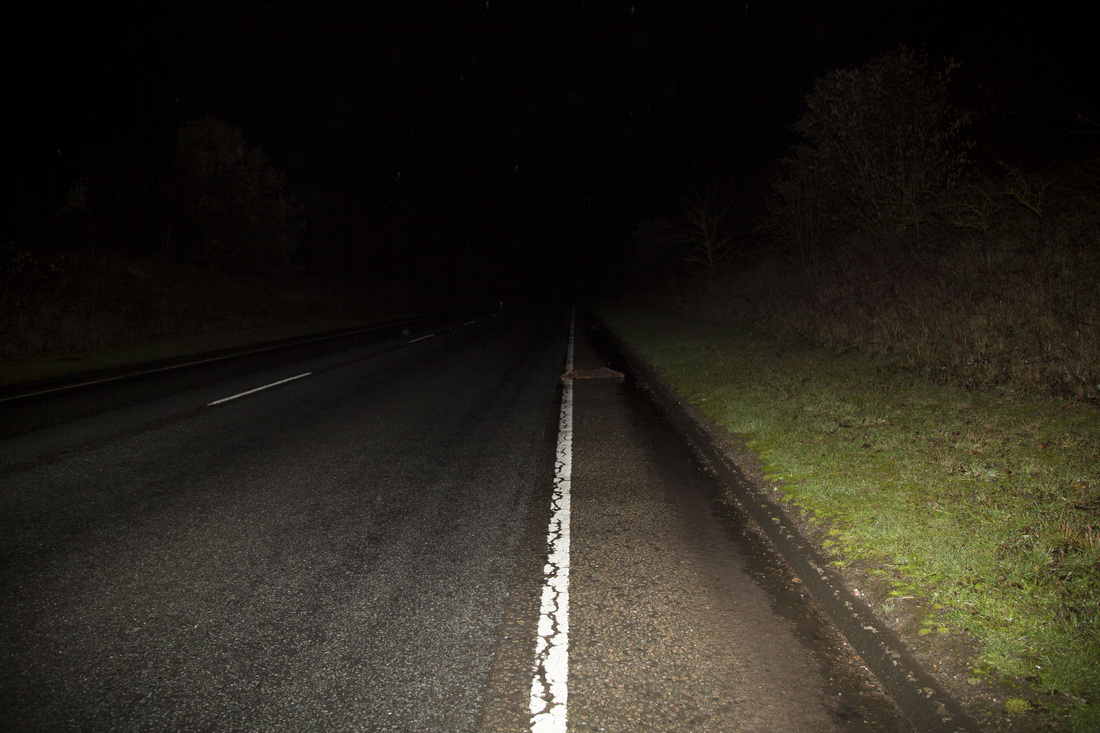
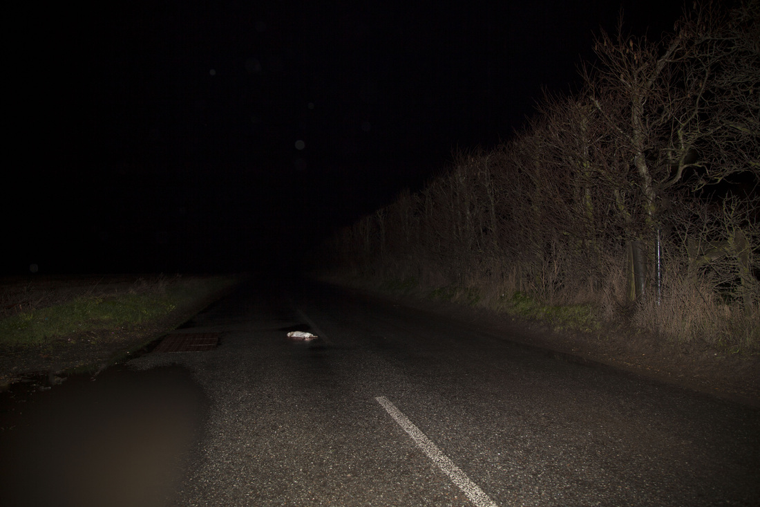
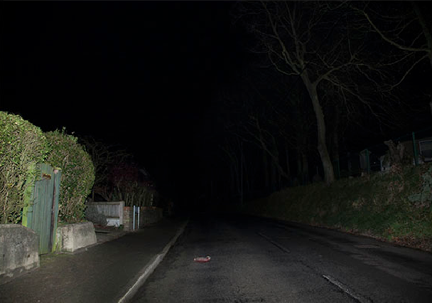
The idea behind the project was to show the distraction humans are causing to the landscape around us. Its been on the news and game shows that badgers are the no.1 animal killed on the roadside and the govement is treating it like a badger cull. Theses animals are often treating as a joke or tossed to the side and forgotten. These images are a reminder of the destruction we are causing on the landscape as population rises and the land animals live in Is destroyed for new houses. We need to take the time to remember the ones lost before they all disappear. I know that’s a little way off but if we start doing something now maybe we don’t have to get there. Kelly Richardson’s work is a vistion of the future something often barren with broken technology showing us glimpsis at the nature once passed. My work is showing the start to the proses.
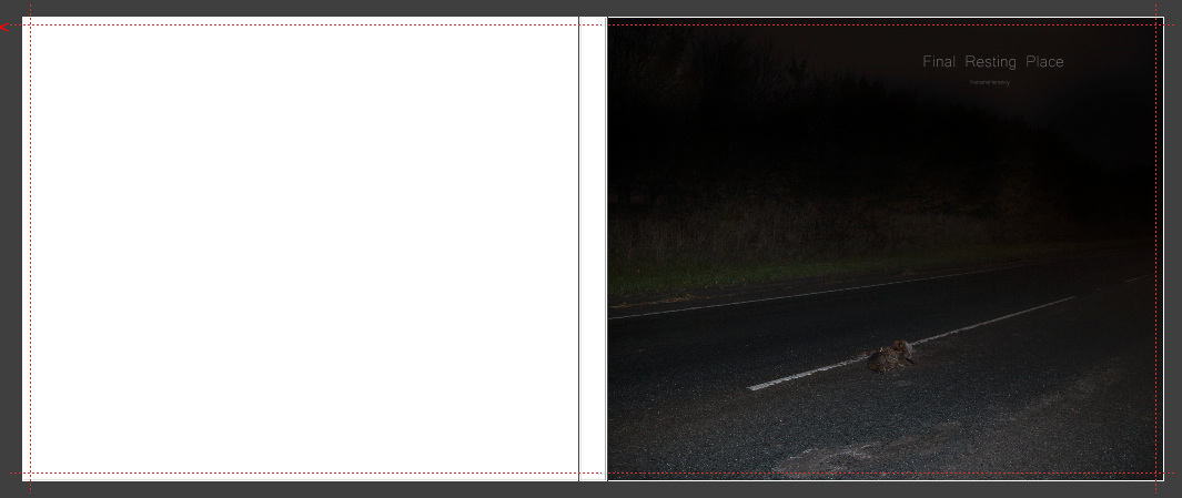
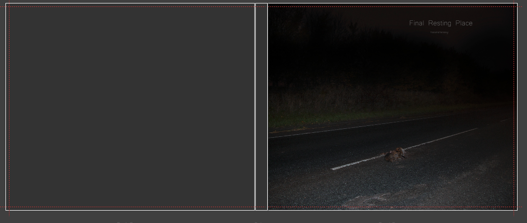
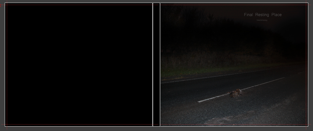
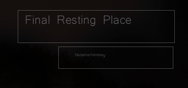
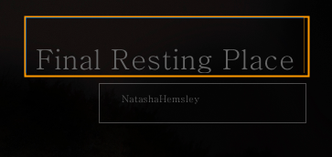
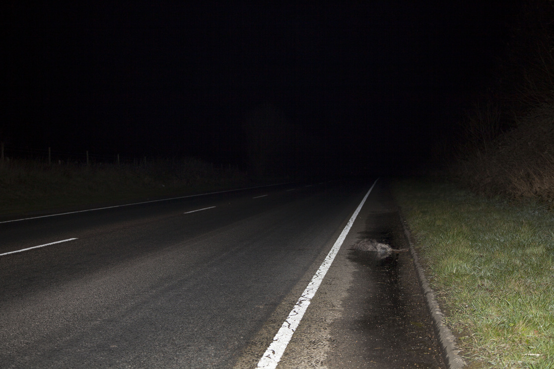
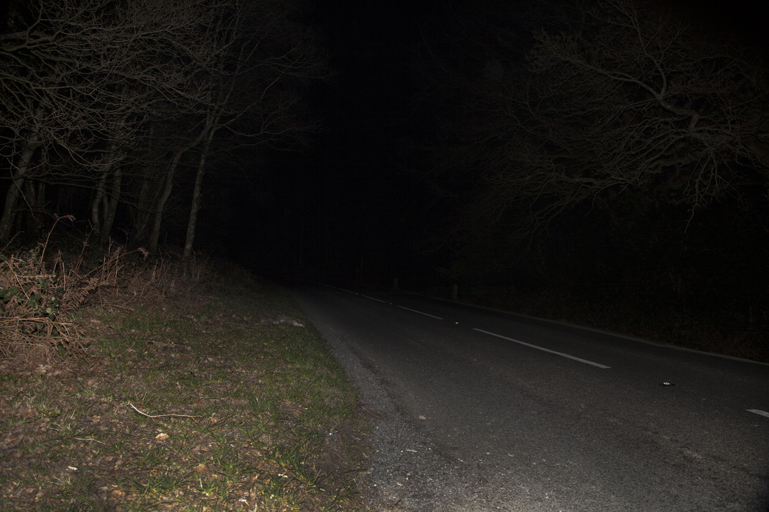
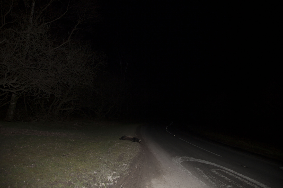
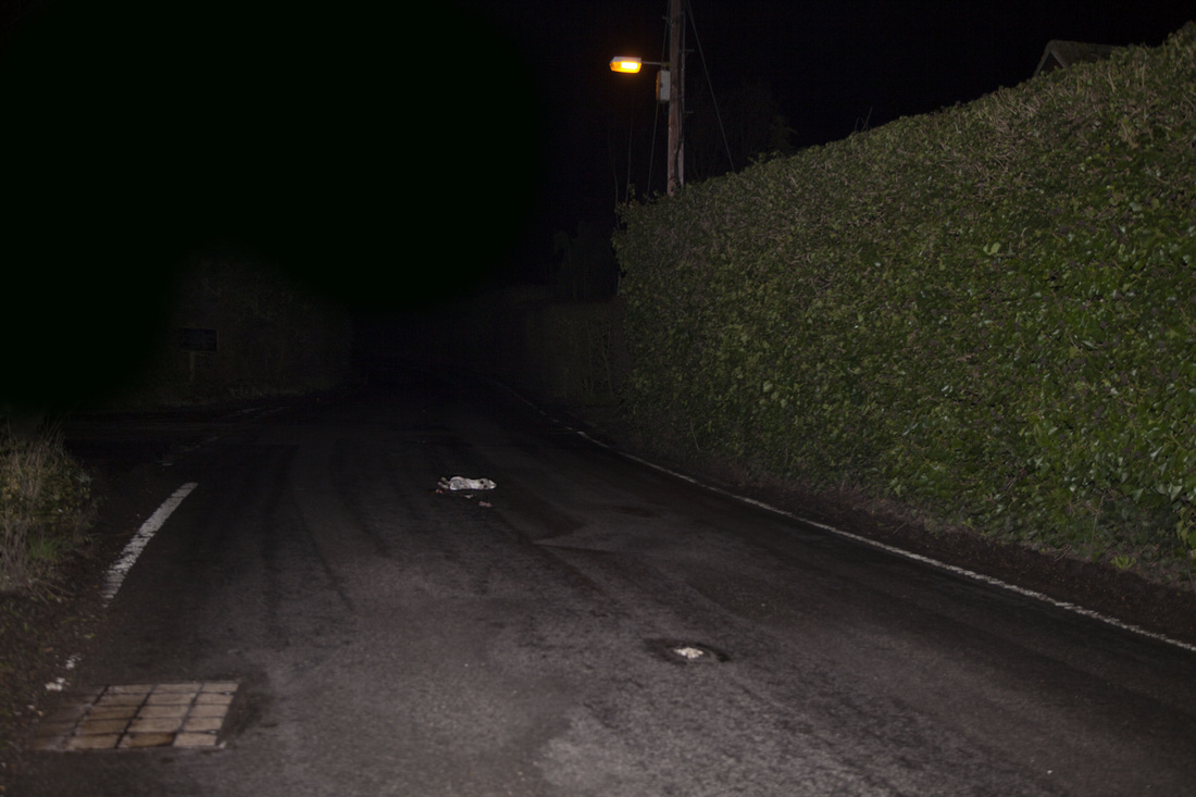
Looking at other artists and the way they depict animal death I came up with a way to show the animals in their liminal state between life and death. I wanted the project to have punch while keeping the animas beautiful. the idea started of with the consideration of frederic delangle work I loved the way he paints in to the landscape with his car headlight it seemed very appropriate to use headlights an cars are the reason the animals are becoming road kill. This approach to working didn’t work in the way I would have liked I think everything looked to orange the exposure times and flash combination I was using didn’t work. So I changed idea and took inspiration form the crime scene photographers Weegee and Melanie Pullen the use of flash illuminated the subject in a way I didn’t think was possible I though the flash on its own wouldn’t work but when I tried it it worked very well and the fading to black wit in the images was still there so a carries on this tequnec through out the rest of my images I did have some problems at first working with a camera its something don’t often do I like to work coverless but thought I should push my self to do something different and out of my comfort zone. Focusing on the animal was probably the hardest thing I had to do on the small screen its so hard to tell if something is in focus I used bex and a torch light to focus each image but some are just a little out of focus it’s the one think I was constantly conserved about. Finding animals was the second problem we went out 3 – times a week and some weeks found nothing we did regular tweets asking people to contact us if the had seen anything but no one responded. Towards the end I still didn’t have ten images that I was happy with so I went back to crow borough where I went out my sister had driven to collage and had seen a fox a pheasant and a rabbit when we went back at night all three had gone so that was very disappointing I don’t know where they had gone perhaps the road kill man had eaten them. The next day we went over the forest and found three badgers in the same area these completed the last of my images. I was a bit disappointed we didn’t find a wider variety of animals my mum had told me of 3 occasions there where dear on the rods back in crowborough but u could not get home because of dilatation hand ins and group crits. If I had more time I’m sure we would have found more animals. The idea to put the images in to a book seemed more stable than prints it last longer something I really wanted with in my work I didn’t won’t it to be there and then go after 5 days. The book keeps all the images contained together as a collective voice. The book size is quite small 8x10 I the reason behind this is so you have to look at the image to find the death It not in your face its softer that’s what I am hoping I don’t want to shock people. The captions are trying to give some sort of meaning to the death a personality again I wanted people to feel something with the images I didn’t want them to be cold. The placement and font of he captions is something I put a lot of though I to although I’m not sure I like them as much as I did when I first did them. They are centred to the bottom of the image. I wanted them to be at eye view but not in the centre of the image. But I don’t know how I would do them if I was to re create the book. The soft back book is something I like its flexible I wanted it to be a little fragile to mimic the animals. The hard back may have given the wrong meaning that an animal is indestructible, hard this is something I wanted to stay away from as much as I could I wanted the design of my book to mimic the ideas behind the project. The cover is something I would change if I had the choice I don’t like the gloss I wish it was matt it dose show your reflection but that might not be so bad it shows you with in the image with in the death. I do like the title again I spent a long time tiring to figure out where to put it and I am happy it doesn’t over power the rest of the image. The image on the front of the book is also something I was unsure of but looking in to other photo books having an image on the front was comments practice. The image is not in the book because it is long exposure I did darken the sky to make it fit in with the rest of the imagery. I chose it because the fox is closer up than the others so if people glance at the book cover they will instantly see what’s going on. So over all I am happy with the way the images turned out the only thing holding the project back is the lack of animals I think my book could have dose with 6 more images before the subject became repetitive. Also the focusing was something I was having trouble with that’s something that did stop me using a few images. The screen on the camera was very small so it was hard to tell if the image was in focus had been thinking of shooting tethered to be able to see if the images where in focus but I did seem like a lot of hassle to keep hold of the laptop camera and still be able to shoot
Over all I am happy with the results of a years work it had been very time consuming going out 2 3 times a week looking for road kill.
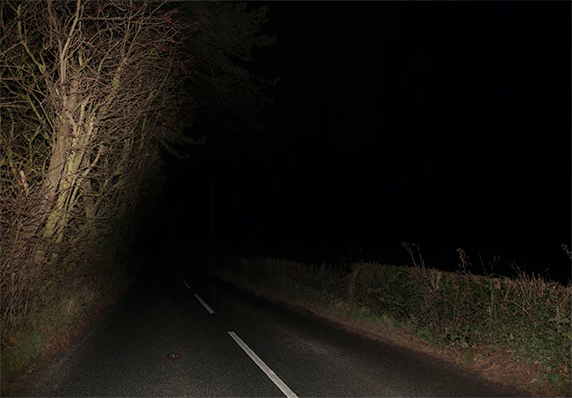
The idea behind the project was to show the distraction humans are causing to the landscape around us. Its been on the news and game shows that badgers are the no.1 animal killed on the roadside and the govement is treating it like a badger cull. Theses animals are often treating as a joke or tossed to the side and forgotten. These images are a reminder of the destruction we are causing on the landscape as population rises and the land animals live in Is destroyed for new houses. We need to take the time to remember the ones lost before they all disappear. I know that’s a little way off but if we start doing something now maybe we don’t have to get there. Kelly Richardson’s work is a vistion of the future something often barren with broken technology showing us glimpsis at the nature once passed. My work is showing the start to the proses.
Looking at other artists and the way they depict animal death I came up with a way to show the animals in their liminal state between life and death. I wanted the project to have punch while keeping the animas beautiful. the idea started of with the consideration of frederic delangle work I loved the way he paints in to the landscape with his car headlight it seemed very appropriate to use headlights an cars are the reason the animals are becoming road kill. This approach to working didn’t work in the way I would have liked I think everything looked to orange the exposure times and flash combination I was using didn’t work. So I changed idea and took inspiration form the crime scene photographers Weegee and Melanie Pullen the use of flash illuminated the subject in a way I didn’t think was possible I though the flash on its own wouldn’t work but when I tried it it worked very well and the fading to black wit in the images was still there so a carries on this tequnec through out the rest of my images I did have some problems at first working with a camera its something don’t often do I like to work coverless but thought I should push my self to do something different and out of my comfort zone. Focusing on the animal was probably the hardest thing I had to do on the small screen its so hard to tell if something is in focus I used bex and a torch light to focus each image but some are just a little out of focus it’s the one think I was constantly conserved about. Finding animals was the second problem we went out 3 – times a week and some weeks found nothing we did regular tweets asking people to contact us if the had seen anything but no one responded. Towards the end I still didn’t have ten images that I was happy with so I went back to crow borough where I went out my sister had driven to collage and had seen a fox a pheasant and a rabbit when we went back at night all three had gone so that was very disappointing I don’t know where they had gone perhaps the road kill man had eaten them. The next day we went over the forest and found three badgers in the same area these completed the last of my images. I was a bit disappointed we didn’t find a wider variety of animals my mum had told me of 3 occasions there where dear on the rods back in crowborough but u could not get home because of dilatation hand ins and group crits. If I had more time I’m sure we would have found more animals. The idea to put the images in to a book seemed more stable than prints it last longer something I really wanted with in my work I didn’t won’t it to be there and then go after 5 days. The book keeps all the images contained together as a collective voice. The book size is quite small 8x10 I the reason behind this is so you have to look at the image to find the death It not in your face its softer that’s what I am hoping I don’t want to shock people. The captions are trying to give some sort of meaning to the death a personality again I wanted people to feel something with the images I didn’t want them to be cold. The placement and font of he captions is something I put a lot of though I to although I’m not sure I like them as much as I did when I first did them. They are centred to the bottom of the image. I wanted them to be at eye view but not in the centre of the image. But I don’t know how I would do them if I was to re create the book. The soft back book is something I like its flexible I wanted it to be a little fragile to mimic the animals. The hard back may have given the wrong meaning that an animal is indestructible, hard this is something I wanted to stay away from as much as I could I wanted the design of my book to mimic the ideas behind the project. The cover is something I would change if I had the choice I don’t like the gloss I wish it was matt it dose show your reflection but that might not be so bad it shows you with in the image with in the death. I do like the title again I spent a long time tiring to figure out where to put it and I am happy it doesn’t over power the rest of the image. The image on the front of the book is also something I was unsure of but looking in to other photo books having an image on the front was comments practice. The image is not in the book because it is long exposure I did darken the sky to make it fit in with the rest of the imagery. I chose it because the fox is closer up than the others so if people glance at the book cover they will instantly see what’s going on. So over all I am happy with the way the images turned out the only thing holding the project back is the lack of animals I think my book could have dose with 6 more images before the subject became repetitive. Also the focusing was something I was having trouble with that’s something that did stop me using a few images. The screen on the camera was very small so it was hard to tell if the image was in focus had been thinking of shooting tethered to be able to see if the images where in focus but I did seem like a lot of hassle to keep hold of the laptop camera and still be able to shoot
 RSS Feed
